Here's 2 of the images I reprocessed. When I did them originally it was on the Macbook, which is really too small to see anything clearly with a 13" screen, and the screen is also not terribly good and washed out. Spent a little time working on them following comments I'd received (after asking for critique) about them having too much black and being dark & uninteresting - which was true.
My concern is that they're less natural and a bit gaudy, though I've tried to be careful with the colours.
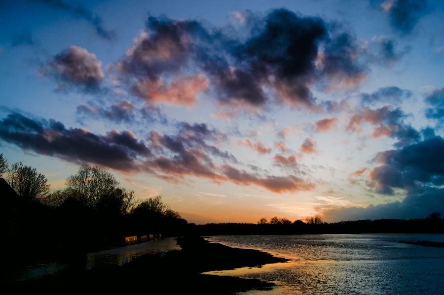
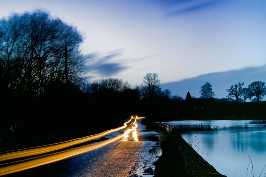
The digital fashion these days is to have very little dark, which often creates images with almost no black. To me this feels odd.
ReplyDeleteI like your images. They don't look overcooked to me. One thing I do often is if the saturation is going up eithe because of prices sing the colours or adding contrast I slide the vibrance down, or I slide the saturation down & compensate with a little more vibrance. This seems to bring things back to a natural position.
Thanks for the tip, very much appreciated. I since reworked the bottom image again in lightroom (this was done using photodirector) and was surprised how much detail could be pulled from the black in this program.
ReplyDeleteRegarding blacks, as you say, there's a tendency not to allow any area of an image to be lost now, and I'm sure it's down to people watching the histogram when they're processing images - an image is 'perfect' when it just touches the edges at both ends, sometimes without regard to actual appearance.
I agree. It's similar to something else I've seen in music as well, people EQ by looking at the plugin rather than listening. I guess the visually oriented digital tools encourage this..
ReplyDeleteIt's hard not to do that to a degree though, and Lightroom really encourages that kind of 'flying-by-instruments' approach. I have found myself watching the curves shift along the histogram while adjusting sliders, and also watching for the 'out of range' marker colours appearing instead of judging by density.
ReplyDeleteInterestingly I reworked the lower image a third time, but using lightroom instead of Photodirector as I had the previous 2 times. The amount of additional data in areas that were otherwise black surprised me considerably (and were part of the reason for me buying the software - that and the way it handled skin tones in portraits).